Making “managed forms” a little more manageable. Making “managed forms” a little more manageable Aligning elements in the 1c managed forms group
And Data Transfer Object to code structuring, controlled form in the 1C 8.2 environment.
Introduction
Let's start with a short description of the concept of "managed form" and related concepts of the 1C platform. Platform connoisseurs may want to skip this section.In 2008 it became available a new version platform 1C: Enterprise 8.2 (hereinafter referred to as the Managed Application), which completely changes the entire layer of work with the interface. This includes the command interface, forms, and the window system. At the same time, not only does the model for developing the user interface in the configuration change, but also a new architecture for separating functionality between the client application and the server is proposed.
The managed application supports the following types of clients:
- Thick client (normal and managed launch mode)
- Thin client
- Web client
The main differences of managed forms for a developer:
- Declarative, not “pixel by pixel” description of the structure. The specific placement of elements is performed automatically by the system when the form is displayed.
- All functionality of the form is described as details And teams. Details are the data that the form works with, and commands are the actions to be performed.
- The form runs on both the server and the client.
- In the client context, almost all application types are unavailable, and accordingly it is impossible to change the data in the infobase.
- For each method or form variable, it must be specified compilation directive, defining the execution location (client or server) and access to the form context.
- &OnClient
- &On server
- &OnServerWithout Context
- &OnClientOnServerWithout Context
All further discussions will be about the right side of the illustration, about how to structure the module code and what principles will allow you to implement effective client-server interaction.
Let's define the problem
Several years have passed since the new version of the 1C platform is actively used and many solutions (configurations) have been released by both 1C and its many partners.During this time, have developers developed a common understanding of the principles of client-server interaction when creating forms, and has the approach to implementing software modules changed in the new architectural realities?
Let's look at the code structure (form module) in several forms of the same standard configuration and try to find patterns.
By structure we mean sections of code (most often these are comment blocks) allocated by the developer to group methods and compilation directives for these methods.
Example 1:
Section of event handlers Method - on the client Method - on the server Method - on the client Section of service procedures and functions Auxiliary input control functions
Example 2:
Service procedures and functions Payment documents Values Event handlers
Example 3:
Service procedures on the server Service procedures on the client Service procedures on the server without context Header event handlers Command event handlers
Example 4:
General-purpose procedures Form event handlers Procedures of the “contact information” subsystem
Essentially, the code structure is missing, or to put it mildly, it is similar to what was in Forms 8.1:
- Non-informative words “General, Service, Auxiliary”.
- Timid attempts to separate client and server methods.
- Methods are often grouped by interface elements “Working with tabular part Products, Contact information".
- Arbitrary arrangement of methods and code groups. For example, Event Handlers may be at the top in one form, at the bottom in another, not highlighted at all in a third, etc.
- And let's not forget that this is all within one configuration.
- Yes, there are configurations in which the words “General, Service, Auxiliary” are always in the same places but...
Why do you need code structure?
- Simplification of maintenance.
- Simplify learning.
- Recording general/important/successful principles.
- ...your option
Why doesn't the existing development standard from 1C help?
Let's look at the principles published on ITS disks and in various “Developer's Guides...” that are recommended when writing a managed form.- Minimize the number of server calls.
- Maximum computing on the server.
- Non-contextual server calls are faster than contextual ones.
- Program with client-server communication in mind.
- and so on.
Design patterns or generational wisdom
Client-server interaction has been used in various software technologies for decades. The answer to the questions outlined in the previous section has long been known and is summarized in two basic principles.- Remote Facade(hereinafter Interface remote access)
- Data Transfer Object(hereinafter referred to as Data Transfer Object)
- … Each object potentially intended for remote access must have low granularity interface, which will minimize the number of calls required to perform a specific procedure. ... Instead of requesting an invoice and all its items separately, you need to read and update all invoice items in one request. This affects the entire structure of the object...Remember: remote access interface does not contain domain logic.
- ...if I were a caring mother, I would definitely tell my child: “Never write data transfer objects!” In most cases, data transfer objects are nothing more than bloated field set... The value of this disgusting monster lies solely in the possibility transmit multiple pieces of information over the network in one call- a technique that is of great importance for distributed systems.
Examples of templates in the 1C platform
Applied software interface available to the developer when developing a managed form, contains many examples of these principles.For example, the OpenForm() method, a typical “rough” interface.
OpeningParameters = New Structure("Parameter1, Parameter2, Parameter3", Value1, Value2, Value3); Form = OpenForm(FormName, OpeningParameters);
Compare with the style adopted in v8.1.
Form = GetForm(FormName); Form.Parameter1 = Value1; Form.Parameter2 = Value2; Form.Open();
In the context of a managed form, there are many “Data Transfer Objects”. You can select systemic And developer-defined.
System ones model an application object on the client, in the form of one or more form data elements. It is impossible to create them without reference to the form details.
- DataFormsStructure
- DataFormsCollection
- DataFormStructureWithCollection
- DataShapesTree
- ValueInFormData()
- FormDataValue()
- CopyFormData()
- ValueInFormAttributes()
- FormAttributesValue()
Example 1C v8.1:
// on the client in the context of the form FillUserCache(DepartmentLink)
Example 1C v8.2:
// on the server in the context of the form ProcessingObject = Form AttributesValue("Object"); ProcessingObject.FillUserCache(DepartmentRef); ValueВFormAttributes(ProcessingObject, "Object");
Data transfer objects, the structure of which is determined by the developer, are a small subset of the types available on both the client and the server. Most often, the following are used as parameters and results of methods of a “coarsened” interface:
- Primitive types (string, number, boolean)
- Structure
- Correspondence
- Array
- Links to application objects (unique identifier and text representation)
&OnServerWithoutContext Function ServerChangeOrderStatus(Orders, NewStatus) Errors = New Match(); // [order][error description] For Each Order From Orders Cycle StartTransaction(); Try DocOb = Order.GetObject(); …. other actions, possible not only with the order... Exception CancelTransaction(); Errors.Insert(Order, ErrorDescription()); EndAttempt; EndCycle; Return Error; EndFunction // ServerChangeOrderStatus()
Structuring the code
The main goals that the managed form module should reflect and approaches to the solution.- Clear separation of client and server code. Let’s not forget that at the time of execution these are two interacting processes, each of which has significantly different available functionality.
- Clear identification of the remote access interface, which server methods can be called from the client and which cannot? The names of remote interface methods begin with the prefix "Server". This allows you to immediately see the transfer of control to the server while reading the code, and simplifies the use of contextual help. Note that the official recommendation (ITS) suggests naming methods with postfixes, for example, ChangeOrderStatusOnServer(). However, we repeat that not all server methods can be called from the client, and therefore logical accessibility is more important, rather than compilation location. Therefore, with the prefix “Server” we mark only the methods available to the client; let’s call the example method ServerChangeOrderStatus().
- Readability. A matter of taste, we accept the order when the module begins with the procedures for creating a form on the server and remote access methods.
- Maintainability. There must be a clear location for adding new code. An important point is that method templates automatically created by the configurator are added to the end of the module. Since event handlers for form elements are most often automatically created, the corresponding block is located last, so as not to drag each handler to another place in the module.
- Graphical option – clearly shows the main flow of execution.
- The text option is an example of a template design for quickly inserting a structure into new module forms.

//////////////////////////////////////////////////////////////////////////////// // <(c) Автор=""Date=""/> // <Описание> // // //////////////////////////////////////////////// ///////////////////////////// // MODULE VARIABLES ///////////////// //////////////////////////////////////////////// ////////////// // ON THE SERVER //******* EVENTS ON THE SERVER ******* &On the Server Procedure When Created on the Server (Failure, StandardProcessing) //Insert the contents of the handler End of Procedure //******* REMOTE ACCESS INTERFACE ******* //******* BUSINESS LOGIC ON THE SERVER ******* ///////// //////////////////////////////////////////////// //////////////////// // COMMON METHODS OF CLIENT AND SERVER ////////////////////// //////////////////////////////////////////////// //////// // ON THE CLIENT //******* BUSINESS LOGIC ON THE CLIENT ******* //******* TEAM ******* //******* CLIENT EVENTS ******* /////////////////////////////// /////////////////////////////////////////////// / / MAIN PROGRAM OPERATORS
Related questions
In conclusion, we will outline several areas that are useful to think about when programming client-server interaction.- Remote access interface implementation options. Asynchrony, level of detail...
- Caching. 1C made an unsuccessful architectural decision, introducing caching only at the level of calling methods of common modules and not providing control capabilities (relevance time, reset on demand).
- Implicit server calls. Do not forget about technological features; many “harmless” operations on the client provoke the platform to contact the server.
Introduction
Managed forms. A new 1C development designed to make the developer’s work easier, giving him more time to write code by simplifying interface design. In fact, it often turns out that the so-called. "controlled forms" are completely uncontrollable. UVs cannot do such banal things as minimizing/maximizing a window, not to mention its positioning on the screen and setting its size in pixels. Perhaps these functions were considered unclaimed and were not included in the new interface, but practice shows that they are sometimes very lacking. For some time the problem was partially solved by WSH, but I wanted something more. This is how an external component was implemented to make “managed forms” a little more manageable.
What? Where? When?
This VK is a library of functions for controlling the state and position of windows. The library also contains several useful system functions.
Window state control:
Expand ( HeaderWindow ) — expands the window to full screen
Collapse (WindowTitle) - minimizes the window to the taskbar
Hide (WindowTitle) - hides the window (while the form code continues to be executed)
Show () - shows the last hidden function hide() window
CollapseWindow (WindowTitle) - in restores the window to its original state
TRUE Visibility (WindowTitle) - p checks whether the window is visible on the screen
TRUE Expanded (WindowTitle) - checks whether the window is maximized to full screen
TRUE Collapsed (WindowTitle) - checks whether the window is minimized to the taskbar
Set Transparency(WindowTitle, Coefficient) - sets the transparency of the window. The degree of transparency is set using a coefficient (0-255).
Window position control:
GetPosition(Window Title, X, Y) - Gets the coordinates of the upper left corner of the window relative to the screen. Coordinates are returned via parametersX,Y.
Move(Window Title, X, Y) - moves the window to a specified positionXY. In this case XYare the coordinates of the upper left corner of the window.
Get Sizes- gets the window dimensions in pixels. The values are returned through the corresponding parameters.
Set Sizes(WindowTitle, Width, Height) - sets the window size in pixels.
System functions:
GetCurrentPermission(Horz, Vert) - gets the current screen resolution. The values are returned through the corresponding parameters.
GetPermissionList() - gets a list of screen resolutions available in the system. The data is returned in the form “RESOL.1, RESOL.2, RESOL.3...”. In the demo processing there is an example of generating a list of permissions on a form.
SetPermission(SelectedScreenResolution) - sets the screen resolution. The parameter specifies the serial number of the permission. The demo processing shows an example of setting a resolution from a previously generated list.
Bonuses:
Sleep (Sleeptime) sleep().Sleep time is indicated in milliseconds.
Signal (Frequency, Duration) - implementation of the classic functionbeep().Allows you to set the frequency and duration of the sound.
Total
The library was written for our own needs and will probably be further developed as needed. If someone has a bright idea to expand its functionality within the subject area for which it was conceived, then write your wishes. If the ideas turn out to be worthwhile, they will be implemented.
The delivery set includes: A base with a connected VC in the form of a general layout and demonstration processing. VK in zip archive.
Implemented in version 8.3.7.1759.
To make it clear what we are talking about in this article, it is necessary to make a small explanation.
A feature of managed forms is that the developer does not directly shape the appearance of the form. The developer only creates a description of the form using some logical rules. Based on these rules, the platform independently generates a visual representation of the form. Moreover, this visual representation depends on the size of the window in which the form is displayed. The same form shown in a narrow window or in a window expanded to full screen will have a different visual appearance.
So, that part of the platform that forms the visual representation of the form is called the mechanism for placing elements in the form.
Why was a new mechanism needed?
Firstly, the previous mechanism, unfortunately, had shortcomings. The most significant of these was that many changes to the properties of form elements performed on the client required a call to the server. And any access to the server leads to slowdown.
Second, we assessed the experience of using managed forms and discovered a number of critical needs that needed to be addressed.
And thirdly, we wanted to build into the new mechanism opportunities for future development.
Major changes
The operation of the previous mechanism can be schematically represented as follows:
The developer creates a tree of form elements in the configurator and sets the properties of the elements. At the moment when the application solution needs to show the form to the user, the following happens. First, the platform creates a description of the visual form on the server. Then this description is transmitted to the client. And on the client, the visualizer generates the image that the user will see.
The main action that was performed on the server when creating a description of the visual form was calculating the lengths of the lines. This refers to all kinds of headings, inscriptions, and so on. Knowing the lengths of the lines, you can already calculate the arrangement of elements in the form.
Since this operation was performed on the server, there were two negative aspects. Firstly, for the calculation we used not the fonts that will be used on the client, but those installed on the server. And they may differ, especially when it comes to different platforms (Windows, Linux). Or even the necessary fonts may not be installed on the server at all. Secondly, to calculate the lengths, we used the font rasterization engine that is on the server. And it may not work exactly like the mechanism for rendering text strings that exists on the client in an Internet browser, for example. As a result, forms could appear with either “truncated” texts or, conversely, with overly wide inscriptions.
Another problem was that there was no adaptation to the size of the window in which the form would be shown to the client. In fact, on the server, the description of the form was created based on the minimum possible window size, and the further success of its display depended on how well it “can” stretch.
In the new mechanism, we divided the generation of a description of a visual form, which was previously entirely performed on the server, into two parts, server and client:

The server part has become significantly smaller. It does not perform any calculations. Only a “blank” description is created on the server, which does not contain the exact lengths of the text fields, and adaptability elements are not allowed in it. The server handles the visibility of elements, but only that which is determined by functional options and that which is set by the user. But here it is impossible to do otherwise, because the functional options themselves are available only on the server. And interactive changing of settings by the user will in any case lead to a server call.
The result is a kind of “semi-finished product” of a visual representation of the form, which is transferred to the client.
The necessary modifications to the description of the visual form are made on the client. Line lengths are calculated, responsiveness elements related to the size of the client display are calculated, and visibility is worked out. After this, as before, the visualizer starts working, which creates the final form that the client sees.
Due to the fact that the calculation of string lengths is carried out on the client, we were able to get rid of unnecessary and sloppy “gaps” between elements. And working out visibility on the client without accessing the server made it possible to speed up the work of the forms. Because turning on/off the visibility of form elements is one of the most common operations.
Some new features
Responsive interface elements
The new mechanism for placing elements on the form not only improves the capabilities that were available before, but also adds new capabilities. For example, it adapts the appearance of the form to the size of the client display. There are several ways to do this.
First, automatic line wrapping is performed, adjusting the height of headings and decorations. You can see how this works in the figure:

If there are long lines in the form that can be broken into individual words, then such lines are wrapped if necessary. Accordingly, the height of the form increases, because its lower part “moves” down. As a result, the form will look normal even on narrow screens. Moreover, this mechanism works dynamically, which means you can compress the form in real time, and long lines will wrap along with it.
Automatic wrapping works for element titles, group titles, text decorations, and text in buttons that have the Hyperlink view.
The second element of adaptability is changing the orientation of groups. Groups and the form as a whole have a new orientation option - “Horizontal if possible.” In this option, if the client display allows elements to be positioned horizontally, they are positioned horizontally. If not, then they are located vertically.
The third element of adaptability is the automatic determination of the number of columns of a switch or toggle switch. Previously, unless there were special instructions, the number of columns was set to the maximum, and it was displayed in one line. Now, in the same situation, the width of the form is analyzed and the number of columns is set so that the switch/toggle switch will look good on the screen.
Horizontal and vertical alignment
Previously, this possibility was absent, and to implement non-standard alignment it was necessary to invent various “tricks”. Now the form and group can be specified how its elements should be aligned vertically and horizontally. For example, in the image below, a group of buttons shows three possible alignment options: Left, Center and Right:

In this picture, the buttons are placed in a regular group that stretches horizontally. The placement of buttons within a group is controlled by the group's HorizontalPositionSubordinates property.
External alignment control
For example, you have a form in which the Department field, Address and Phone groups are located. The previous mechanism aligned the fields of these groups as shown in the left figure. The fields on the form were aligned with each other, and the fields in each group were aligned with each other.

Now you have the opportunity to set end-to-end alignment for groups, as a result of which, for example, all form fields will be aligned equally. This option is shown in the right picture.
Moreover, you can manage end-to-end alignment for each group separately. Therefore, you can, for example, disable end-to-end alignment for the Phone group, and then the form will look like shown in the right figure.

Aligning Elements and Headings
Another new feature that has appeared is the ability to control the relative position of elements and headings. Both in all forms and in individual groups. For example, you can “stretch” headings and elements to different edges of the form, or vice versa, “pull” them towards each other, aligning headings to the right and elements to the left.

Limiting the maximum width of elements
Previously, if you told an element to stretch, the element would stretch as far as it could. For example, full screen. For some elements this was good (like an HTML field), but for other elements it might not be so good. For example, for numeric fields. Because the numeric data, or buttons that control the field, ended up somewhere far to the right.
Now elements have Boolean properties, with which you can set the automatic stretching mode in width or height. In this mode, the platform independently determines to what limits the field can be stretched. If automatic mode is disabled, then the platform will behave the same as before. If you specify a specific field width/height, that will be used. And if you specify a value of 0, then the element will stretch as far as possible.
Controlling the spacing between elements
It is also possible to control the horizontal and vertical spacing between elements. For example, in the following figure, the left group has increased vertical spacing, while the right group has decreased vertical spacing.

Disable form stretching
We have implemented another, new mode of operation of the form, which disables vertical stretching of its elements. This mode will be useful for forms containing a small number of elements.
Disable scrolling on pages
For forms containing a large number of elements, we also changed the behavior slightly. Now vertical scrolling does not appear on pages. Vertical scrolling can now be on the form itself or inside form elements, such as a table, spreadsheet document, and so on. And the form page will always be at full height. This should make the user experience easier, because a large number of scrollers on a form can often be confusing and confusing.
Summary
In this review article, we have listed only the main features provided by the new mechanism for placing elements in the form. But no less important, in our opinion, is that this mechanism contains a significant reserve for future development.
On regular forms, the location of elements is drawn entirely manually. To facilitate this process, the platform offers several mechanisms:
- element alignment- provides automatic centering, or “pressing” controls to each other’s guidelines, or aligning the sizes of controls:
- net- through the Options you can configure the display of the grid for precise manual alignment of elements:
The correct answer is the second one. This is a panel for aligning and unifying the sizes of elements.
Question 10.79 of exam 1C: Platform Professional.
- Nothing will change
- The element "Inscription1" will be shifted horizontally and its right border will be aligned with the right border of the element "Inscription2"
- The element "Inscription2" will be shifted horizontally and its right border will be aligned with the right border of the element "Inscription1"
- Both elements will move to the right edge alignment line of the form
The correct answer is the second one. The labels will be aligned to the right.
Question 10.82 of exam 1C: Platform Professional. What happens when you click the command bar button marked in the picture?
- All inscriptions will be the same size horizontally
- Nothing will change
- The labels will shift. The vertical axis of symmetry of each control element will coincide with the vertical axis of symmetry of the form, i.e. centering each control horizontally
- The labels will shift horizontally. The controls will not move relative to each other within the group, i.e. centering, as it were, one element as a whole
- The labels will shift vertically. The controls will not move relative to each other within the group, i.e. centering, as it were, one element as a whole
The correct answer is fourth. All selected controls will be centered around their common centerline.
Question 10.83 of exam 1C: Platform Professional. What happens when you click the command bar button marked in the picture?
- All inscriptions will be the same size vertically. The "Inscription1" control element will be taken as a sample.
- Nothing will change
- All inscriptions will be the same size vertically. The "Inscription3" control element will be taken as a sample.
- Each label will be centered vertically
- There will be an even distribution of inscriptions in the vertical direction. The controls "Inscription1" and "Inscription3" will remain in place, and the element "Inscription2" will be moved in the desired direction. When moving an element, the snap to the layout grid is not taken into account
- There will be an even distribution of inscriptions in the vertical direction. The controls "Inscription1" and "Inscription3" will remain in place, and the element "Inscription2" will be moved in the desired direction. When you move an element, it will snap to the marking grid if the mode for its use is set
The correct answer is the first one. The height of the elements will be standardized
Question 10.86 of exam 1C: Platform Professional. What happens if you click the command bar button canceled in the picture?
- All inscriptions will be the same size vertically and horizontally. The "Inscription1" control element will be taken as a sample.
- All inscriptions will be the same size vertically and horizontally. The "Inscription3" control element will be taken as a sample.
- Nothing will change
- Labels will be automatically aligned
- All labels will have a transparent background.
The correct answer is number four, the button itself is called "Align automatically"
Question 10.90 of exam 1C: Platform Professional. Disable alignment mode using alignment lines in a previously created form:
- It is forbidden
- Can. To do this, in the form properties palette, you need to disable the "Use alignment lines" property.
- Can. To do this, by selecting the main menu item "Tools-Options", on the "Form" tab, you need to disable the "Use alignment lines" property
- Can. To do this, in the form properties palette you need to disable the "Use alignment lines" property or, by selecting the "Tools-Options" main menu item, on the "Form" tab, disable the "Use alignment lines" property
The correct answer is the second one. Alignment lines (marked with an arrow) are disabled by the corresponding form property:
Question 10.92 of exam 1C: Platform Professional. When aligning form elements, a layout grid may be shown:
- Continuous lines
- Checkerboard dots
- Points located at the intersection of marking lines
- Answers 1 and 2 are correct
- Answers 2 and 3 are correct
- Answers 1, 2 and 3 are correct
The correct answer is fifth. The location of the points is controlled by the Checkerboard option in the System Parameters (see screenshot in the post).
Question 10.95 of exam 1C: Platform Professional.
- A special alignment marker that shows the offset of controls. The selected control element is offered to be moved to the left
- A special alignment marker that shows the offset of controls. The selected control element is offered to be moved down
- A special alignment marker showing the overlay of controls. The selected control element is offered to be moved to the left
- A special alignment marker showing the overlay of controls. The selected control element is offered to be moved down
The correct answer is the first one. The bottom margin is shifted to the right relative to the top, so it is proposed to move it to the left.
Question 10.96 of exam 1C: Platform Professional. Can I use alignment lines to resize and move form controls?
- It is forbidden
- Yes, if the controls are attached to these lines
- It is possible if the controls are attached to these lines, but only move them
- It is possible if the controls are attached to these lines, but only resize
- You can, always
The correct answer is the second one. Elements attached to the same guyline can be moved together.
Question 10.97 of exam 1C: Platform Professional. In the figure the red circle marks:
- A special alignment marker that shows the offset of controls. The selected control element is offered to be moved to the left and up
- A special alignment marker that shows the offset of controls. The selected control element can be moved to the right and down
- A special alignment marker showing the overlay of controls. The selected control element is offered to be moved to the left and up
- A special alignment marker showing the overlay of controls. The selected control element can be moved to the right and down
The correct answer is fourth. Where the arrows point, you need to move there.
Question 10.98 of exam 1C: Platform Professional. In the figure the red circle marks:
Question 10.110 of exam 1C: Platform Professional. How can I use the command bar button shown in the figure to align all three labels to the right?
- First, select the “Inscription1” control by clicking on it with the left mouse button and simultaneously pressing the key. Then press the indicated button
- Just click on the indicated button
- Using this button you cannot align the labels, since they belong to different panels
Question 10.115 of exam 1C: Platform Professional. To display a layout grid in an existing form, it is enough:
- In the form properties palette, set the "Use Grid" property
- By selecting the main menu item "Tools-Options", on the "Form" tab, set the "Use Grid" flag
- By selecting the main menu item "Tools-Options", on the "Form" tab, set the "Display grid" flag
- By selecting the main menu item "Tools-Options", on the "Form" tab, set the "Display Grid" flag, and then in the form properties palette set the "Use Grid" property
- By selecting the main menu item "Tools-Options", on the "Form" tab, set the "Display Grid" and "Use Grid" flags
The correct answer is fourth; for the form you can also specify the option to display or not.
The form editor is used to create and edit forms of application solution objects. Object shapes are used by the system to visually display object data as the user works.
Any form represents a combination of three components:
- form dialog - a window that will be displayed on the screen;
- form module - a program in a built-in language responsible for working with form controls and processing events;
- form details - a set of objects belonging to the form, the data of which it uses in its work.
The form editor itself provides editing of the form dialogue, its details and calls the text and module editor to edit the form module.

The form editor window contains three tabs that allow editing of all three components of the form.
Editing a Form Dialog
The form editor allows the developer to take full advantage of a wide range of dialog capabilities. Let's list the main ones:
Panels, pages, bookmarks
The dialog editor allows the developer to place special controls on the form that help give the form its own recognizable style, make access to data simple and clear, and also fit a large amount of information into a limited area.
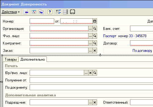
The editor allows you to place several panels on a form, each of which can contain several pages. For example, a document form may contain a panel with two pages: Products and Additional:
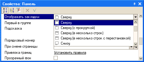
The developer has the ability to set a mode in which pages will scroll within the panel, or use bookmarks to switch between pages. The editor allows you to define a large number of different options for the location and display of bookmarks:
For example, bookmarks can be placed horizontally on top:
Or you can arrange the bookmarks on the left vertically:
Controls
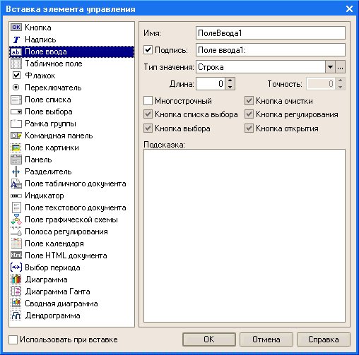
The editor allows you to place a large number of different controls on the form. You can place controls by dragging or using a special dialog for inserting controls, which allows you to simultaneously set the desired properties of the selected control:
In the case where the form contains a large number of controls, the developer can use the mode of displaying controls in a list, which allows you to quickly navigate to the desired control:
The editor provides the ability to specify the order in which the user will bypass the form controls when entering and editing data. It is possible to set an automatic traversal order or manually set the traversal order in a special list of controls, or by clicking the mouse directly on the form:
Grid, alignment
The Form Editor has great capabilities for controlling the placement of elements on the form. In particular, it supports grid layout, where the borders and sizes of controls are aligned to the layout grid located on the form. The developer has the opportunity to change the pitch of the marking grid and thereby achieve a more precise location of the controls:
The editor also supports the use of alignment lines, which serve to facilitate the alignment and relative position of form controls. For example, in the following illustration, alignment lines are used to position controls on the More page:
The developer has the ability to place the required number of horizontal or vertical alignment lines on the page, as well as use invisible alignment lines. The editor creates invisible alignment lines automatically after two or more controls are aligned along any of the boundaries. For example, if two fields of the same size were left aligned, an invisible alignment line will be created along the right aligned borders of those fields.
Alignment of controls can also be done using special markers indicating the desired direction of movement of the controls. Markers appear when two controls are in close proximity to each other.
Blue alignment handles indicate the desired direction of movement of the control to align it with one of the borders of the adjacent control:
The red alignment handles indicate the desired direction to move the control when it overlaps another control:
It should also be said that the editor supports alignment, resizing and ordering operations for a group of controls:
Bindings
The form editor allows you to customize the behavior of controls located in the form, so that when changing the size of the form, a natural perception of information is ensured: one part of the elements remains in place, the other part moves along with the boundaries of the form, and the third part changes its size in accordance with changing the size of the form.
To specify this behavior of form elements, the developer can describe bindings - the dependence of the position of the borders of the controls on the position of the borders of the form. The border of a control can be snapped to the border or center of a form, or to the border or center of another control.
The editor supports a wide variety of different types of bindings and can display them graphically:
Separators
Separators are special controls that allow you to redistribute the space of a form without changing its size. In 1C:Enterprise mode, the separator has the ability to be “grabbed” by the mouse and moved within the form within its limits, taking into account the possibility of the location of other controls and the orientation of the separator:
When you move a separator, all controls bound to the separator will resize or move according to the set anchors:
ActiveX
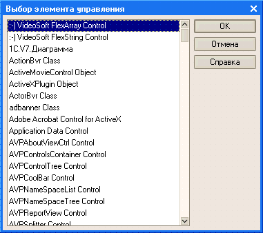
The editor allows you to place ActiveX controls on a form, which the developer can configure and subsequently manage using the built-in language:


Editing a form module
To edit the form module, the configurator calls the text and module editor. This editor provides the developer with a wide variety of options for creating and modifying module text.
Editing form details
Editing form details is performed in the list, which allows you to create new details, change existing details and delete unnecessary details:

If a form has a main attribute that determines the behavior of the form that differs from the standard one, it is highlighted in bold. The developer can place the cursor on the desired attribute and, using the menu command, immediately go to the form dialog, to the control element that corresponds to the selected attribute.
Additional Information
You can become familiar with using the form editor in real time. To do this, you can download the demo video "Example of developing a trading mini-system", which shows the process of developing a trading mini-system using this editor to create document forms "Receipt invoice", "Expense invoice" and report forms "Sales analysis" and " Sales analysis by period."