How to write text under images in html. Formatting text in HTML Beautiful inscriptions in html
Typography is the favorite toy of web designers. CSS has one very interesting tool in its composition - text shadow(text shadow), which at first glance seems simple enough, but it can be used to create memorable effects if you use ingenuity and imagination.
Shadow basics
Property text shadow very easy to use. It is supported by all modern browsers and even without the use of prefixes. But there is no support in IE (even IE9). You can use tools like Modernizr to help pull out CSS3 effects even in older versions of IE.
Syntax
Property syntax is used to create a text shadow text shadow, which is given below. Four parameters need to be defined: the first two set the position of the shadow, the third sets the blur level, and the fourth determines the color of the shadow.
Text-shadow: horizontal_offset vertical_offset blur color;
Below is an example of a text-shadow that is shifted two pixels down and four pixels to the right, blurred by three pixels, and black at 30% opacity.
Text-shadow: 2px 4px 3px rgba(0,0,0,0.3);
Result of use given property will look like this:
Why is rgba used?
You don't have to use rgba to set the shadow color when defining the property. However, rgba adds another dimension to the shadow definition - the level of transparency.
This method is much simpler than other color determination methods. You don't have to focus on defining the shade of the shadow color, which can be just a little darker or lighter than the background color. With rgba you can simply use white or black colors and increase their opacity to achieve the desired background hue when mixing colors.
Using the property text shadow you can create various effects for text, not limited to simple drop shadows. For example, here is the code to create the illusion of indented text.
First you need to set the text color a little darker than the background color. And then you need to use the property text shadow with white color and increased transparency.
The background color is #222 and the text color has an opacity of 60%. The white shadow is positioned slightly down and to the right with an opacity of 10%.
Body ( background: #222; ) #text h1 ( color: rgba(0,0,0,0.6); text-shadow: 2px 2px 3px rgba(255,255,255,0.1); )

It is not necessary to blur the shadow at all. A clear shadow can go well with the design of the site.
Text-shadow: 6px 6px 0px rgba(0,0,0,0.2);

The real fun begins when you throw away the limitation of having only one shadow. By using a comma to separate definitions, you can use as many shadows as you like!
Text-shadow: shadow1, shadow2, shadow3;
Here is an example using two shadows. The first has the same color as the background.
Text-shadow: 4px 3px 0px #fff, 9px 8px 0px rgba(0,0,0,0.15);

Moving down a long distance
Once you master the use of multiple shadows, the result will become more and more expressive. It's very easy to create a 3D effect for text.
The example uses four shadows, all shifted down at different distances and blurred.
Text-shadow: 0px 3px 0px #b2a98f, 0px 14px 10px rgba(0,0,0,0.15), 0px 24px 2px rgba(0,0,0,0.1), 0px 34px 30px rgba(0,0,0,0.1 );

Shift down a small distance and strong blur
Here is another implementation of the same idea. The three shadows are moved a smaller distance and more blurred.
Text-shadow: 0px 4px 3px rgba(0,0,0,0.4), 0px 8px 13px rgba(0,0,0,0.1), 0px 18px 23px rgba(0,0,0,0.1);

3D text by Mark Dotto
The effect is used on MarkDotto.com. It uses 12 different shadows to create a great 3D effect.
Text-shadow: 0 1px 0 #ccc, 0 2px 0 #c9c9c9, 0 3px 0 #bbb, 0 4px 0 #b9b9b9, 0 5px 0 #aaa, 0 6px 1px rgba(0,0,0,.1), 0 0 5px rgba(0,0,0,.1), 0 1px 3px rgba(0,0,0,.3), 0 3px 5px rgba(0,0,0,.2), 0 5px 10px rgba(0 ,0,0,.25), 0 10px 10px rgba(0,0,0,.2), 0 20px 20px rgba(0,0,0,.15);

Embossed text by Gordon Hall
Notice in the example above I called my technique the “quick and dirty” letterpress effect. That's because there's a much more involved way to create some seriously inset text that's much more believable.
Gordon uses some serious CSS voodoo to pull off not only an outer shadow but a genuine inner shadow as well. Check out his blog post for a full explanation of the technique.
background-color: #666666; -webkit-background-clip:text; -moz-background-clip:text; background-clip:text; color:transparent text-shadow: rgba(255,255,255,0.5) 0px 3px 3px;

glow
Text-shadow: 0px 0px 6px rgba(255,255,255,0.7);

Text-shadow: -10px 10px 0px #00e6e6, -20px 20px 0px #01cccc, -30px 30px 0px #00bdbd;

Multiple light sources
Text-shadow: 0px 15px 5px rgba(0,0,0,0.1), 10px 20px 5px rgba(0,0,0,0.05), -10px 20px 5px rgba(0,0,0,0.05);

Color: rgba(0,0,0,0.6); text-shadow: 2px 8px 6px rgba(0,0,0,0.2), 0px -5px 35px rgba(255,255,255,0.3);

Conclusion
Like most CSS effects, shadows are very easy to implement. But the combination simple actions can result in amazing results.
HTML tags defining text alignment, indentation
Justified text used in typography
The example below shows how to align text to width pages:
| align="left" | align="right" |
|---|---|
Every day the number of workers employed in the service sector and the dissemination of information is growing. If the symbols of the past centuries were the farm and the factory, then the symbol of the present 21st century is an office equipped with computers that have access to the information flow. |
|
| align="justify" | align="center" |
Every day the number of workers employed in the service sector and the dissemination of information is growing. If the symbols of the past centuries were the farm and the factory, then the symbol of the present 21st century is an office equipped with computers that have access to the information flow. |
Every day the number of workers employed in the service sector and the dissemination of information is growing. If the symbols of the past centuries were the farm and the factory, then the symbol of the present 21st century is an office equipped with computers that have access to the information flow. |
The justify value provides uniform text alignment right and left, that is in width. This method is widely used in print.
Aligning text in HTML to center and justify
Align text in HTML to center, text to the right:
Result:
Attributes and values
- align="left" - defines left text alignment(default).
- align="center" - aligns text to the center.
- align="right" aligns text to the right.
Alignment | HTML text indent
HTML text and its indentation on the left of the page
Let's produce text indent on the left in two ways:
Result:

View in a new window.
In general, the question itself is not difficult. There is nothing tricky about placing one block on top of another. But still, there are several points worthy of discussion in this matter. I think there are people who will be interested.
The idea is to just overlay some text on the image. The text is presented as blocks of variable length, it is supposed to be located on the left side, with a smooth fill around the text. For example, like in this image:
Document schema
HTML markup

A Movie in the Park:
Kung Fu Panda
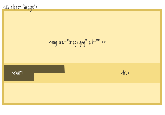
Of course, it would be easier to use a div element to display an image as the background image, but in this case I'm assuming that the image is the content of the document and therefore belongs to HTML. The div element will be used as a container for the absolute positioning of the text within it.
css
.image ( position: relative; width: 100%; /* for IE 6 */ ) h2 ( position: absolute; top: 200px; left: 0; width: 100%; )Thus, we placed the text directly on top of the image. Our next task is to make a background for the text. Since the element
is a block element, we cannot use it for these purposes. Let's use an inline element . Let's wrap the text inside the heading in it.
A Movie in the Park:
Kung Fu Panda
We will use this span to style the text and background:
H2 span ( color: white; font: bold 24px/45px Helvetica, Sans-Serif; letter-spacing: -1px; background: rgb(0, 0, 0); /* in case the next line doesn't work */ background : rgba(0, 0, 0, 0.7); padding: 10px; )
Problems

As you can see from the figure, at the end of a line, the block of text ends immediately after the last character on the line, and starts immediately left-aligned on the next line. padding property for span, in this case, will not help us.
To solve the problem, you need to use additional spans on both sides of the tag
, in which case we can already use padding.
A Movie in the Park:
Kung Fu Panda
With these new spans we will set the padding property:
H2 span.spacer ( padding: 0 5px; )
What about semantics?
At this stage, the design is complete, but one problem remains. Namely, a huge number of additional HTML elements added for design purposes only. I mean spans. To solve this problem, let's use jQuery. To do this, remove all spans in the markup, and add them dynamically:
A Movie in the Park:
Kung Fu Panda
$(function() ( $("h2").wrapInner(" "); $("h2 br").before(" ").after(" ");
});
The appearance of text on the screen depends only on tags, it does not depend on spaces and line breaks.
All design elements of HTML documents are divided into two types: inline and block.
Inline elements can be part of a line, and block elements always take their own space on a web page and always start on a new line. Of course, block elements can include other block elements and inline elements. For obvious reasons, inline elements cannot contain block elements.
Combining web page elements into blocks allows you to apply a single design to them, to implement layout. It will be enough to change the location of the block by changing one unifying tag. Naturally, this is more convenient than changing the location of each element of the web page individually.
Inline elements are framed with tags ...
.
A pair is used to frame block-type elements. ...
.
Browsers frame divs with line breaks.
Block
cannot be placed inside a block .
Example
Blocks
First block of text
Second block of text.
Basic text formatting tags
Example
Headings and paragraphs
header
first level
Second level heading
Third level heading
Fourth level heading
Level 5 heading
Level 6 heading
Paragraph test
Create a text file like in the example. Save it with extension html.
Double-clicking on its name in the folder will launch the default browser, and your html document will already be loaded into it.
Highlighting in text
Example
Text can be bold. The text may be in italics.
Text can be underlined. Text can be crossed out.
The text may be superscript. The text may be subscript.
Quotes, variables, addresses
...
Used to provide the author of the document with contact information so that those who wish can contact the author of the material. Usually displayed in italics. Block element.
Selection of citations. Block element.
...
Selection of citations. Usually displayed in italics.
...
Display text in a fixed-width font. It is used, as a rule, to display a small piece of program code (for large listings, the tag is used ).
...
Highlight important parts of text. Usually displayed in italics.
...
...
Display text in a fixed-width font.
...
Strong emphasis on important passages of text. Usually displayed in bold.
...
Used to mark variable names. Usually displayed in italics.
14.04.2020
Internet
Kung Fu Panda
, in which case we can already use padding.
Kung Fu Panda
Kung Fu Panda
Example
Basic text formatting tags
Example
header
first level
Second level heading
Third level heading
Fourth level heading
Level 5 heading
Level 6 heading
Paragraph test
Create a text file like in the example. Save it with extension html.
Double-clicking on its name in the folder will launch the default browser, and your html document will already be loaded into it.
Highlighting in text
Example
Text can be bold. The text may be in italics.Text can be underlined.
The text may be superscript. The text may be subscript.
Quotes, variables, addresses
| ... |
Used to provide the author of the document with contact information so that those who wish can contact the author of the material. Usually displayed in italics. Block element. |
| Selection of citations. Block element. | |
| ... | Selection of citations. Usually displayed in italics. |
...
|
Display text in a fixed-width font. It is used, as a rule, to display a small piece of program code (for large listings, the tag is used ). |
| ... | Highlight important parts of text. Usually displayed in italics. |
| ... | |
| ... | Display text in a fixed-width font. |
| ... | Strong emphasis on important passages of text. Usually displayed in bold. |
| ... | Used to mark variable names. Usually displayed in italics. |


