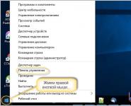
Photos for the group in VK. Review of applications for dating in contact
In the process of its development, the social network Vkontakte has grown from a site for students to a dating site. Vkontakte has a lot of opportunities for finding friends or a soulmate. We will talk about which applications are best for online dating. 
Vkontakte photo rating
Vkontakte dating applications can be divided into 4 groups. The first category includes applications that evaluate the user's photo, and if you like the photo, then you can move on to a closer acquaintance.
The most popular in this group are Topface, Litsemer, Photocards, Photoflirt, as well as the funny application The Pug. You evaluate and you are evaluated. They evaluate only according to external data, so if you still decide to get to know each other in this way, feel free to post the best photo.
The main disadvantage of these applications is that mostly schoolchildren communicate in them, many hide their age and show someone else's photo. There is also a chance to get on a lot of intimate offers. Luckily finding someone in photo apps is possible, but the possibility is too small. But here you can find out which of your photos is especially good.
Chats with photos Vkontakte 
The second category of Vkontakte dating applications is chats with photos. Here you will be appreciated not only by photography, but also by your wit, sense of humor and also your ability to communicate with people. The probability of meeting your soul mate here increases significantly, but the problems of photo applications, however, also remain.
The coolest chat app is “Ask, See, Love“. Three on three can play here and each player can ask questions to the opposite sex, and according to the results of communication, the participants choose the interlocutor they like. If someone's sympathies coincide, then the players will open links to each other's Vkontakte pages. The main thing in the application “Ask, See, Love” is to ask a good question.
Vkontakte video chats

The next group of applications are video chats, where participants communicate with each other via a webcam. The “pluses” of video chats are obvious: communication with the interlocutor is almost live, you immediately see your interlocutor, how he looks in reality. The downside is that you may run into a rude person or you may be “talked”.
Most popular video chats: Vichatter video chat, Video flirt. 
In a separate category, you can highlight such an application as “Coincidence“. This application is completely different from others. Before you get to know someone, you will have to go through a decent questionnaire, about a hundred different questions that will reveal your basic views on communication, on life. After you complete the survey, the application will choose a partner for you, whose test passing is almost the same as yours. This is a very interesting way of dating and we strongly recommend trying this way of dating.
Did you know that almost 80% of the information we receive is in the form of pictures and images? Therefore, visualization is important for groups in social networks. Photos for the VK group must be chosen carefully, taking into account the specifics of the community. It should be bright, clear and reflect the essence of the creation of the group. If the picture is not catchy at first sight, then the user will not even pay attention to the group. We will learn how to put a beautiful picture on the cover, how to create cool images with captions, and where you can upload ready-made photos, below.
How important are photos and pictures to groups?
If you look at the VK news feed, it is almost completely filled with photographs. Why is it worth paying so much attention to this issue? The right attractive picture is the main tool for attracting the attention of users.
Pictures act as the cover of your post. If they are not of high quality, no one will pay attention to the information itself and your group. Sometimes the design style will tell you which group you are in.
There are also communities that focus only on high-quality and beautiful photos without meaningful posts. When it comes to a brand or trade company, the image helps to form an attitude. In any case, it is necessary to carefully and painstakingly choose pictures so that no one doubts the quality of the community and the right first impression is formed for new users.
- images with inscriptions and signs will not work;
- do not forget about copyright;
- Pictures - The best way draw attention to a text post;
- do not post photos with a width of less than 500 megapixels;
- when adding several pictures to a post at once, choose the same size;
- try to stick to the theme, individual style of design and processing.

Where can I get photos and pictures for the VK group?
It is better to add pictures to your public from the relevant resources. On the network you can find thematic sites, pictures from which are right for you. There are resources with templates for creating your own images (banners, postcards, covers), as well as ready-made high-quality photos.
If you want to create something of your own and special (so to speak, “cherry on the cake”), a number of sites will do:
- Erohovec.ru;
- Art-ps.moy.su;
- Vk-oblozhki.ru;
- psd-box.at.ua.

If you need a finished beautiful image, then go to these resources:
- Zastavok.net;
- screenpaper.ru;
- Getwall.ru;
- Wallpaperscraft.com.
On image sites, everything is broken down by topic. It is better to further process the pictures in photo editors to add an inscription, brighten and so on, depending on the format of the group. Canvas or Avatan are suitable for this. Each resource has sections, tips, so even a beginner does not have any difficulties. Plus - they are all free and quite functional.
What size should photos and pictures be for a group?
A separate issue is the size of the image. For the cover, post and avatar, it will be different. The main thing is not to get out of the general style. Looks perfect:
- cover up to 1590 x 400 pixels;
- avatar up to 200 x 500;
- miniature up to 200 x 200;
- pinned post up to 510 x 308.

Pay special attention to the pictures in the post, the recommended width is at least 510 pixels, otherwise you have to add a couple more photos for harmony. Make sure the images are good quality, not stretched and not "flattened".
Remember that you cannot adjust the size when adding several photos, it is determined automatically. You only control the order in which the images appear on the page.
How to make a picture unique, and when should it be done?
It's no secret that any content has a uniqueness, that is, how original the information presented is. And the higher the score, the greater the relevance of the page and the higher the position in search engines. If you're planning to be the leader and don't fall behind, consider uniqueizing your images. It is worth doing this for comprehensive promotion and improvement of SEO indicators. Moreover, cropping, changing the format and filters, adding inscriptions do not change the situation. As practice has shown, the main way to increase uniqueness is to combine several images on one photo at once, that is, to make a thematic collage.
How to add photos and pictures to a VK group?
Adding a finished photo to a group is easy even from a phone, although it is better to use a computer (the algorithm is the same on all devices). This is done as follows:
- create a new entry;

- add information for the post;
- insert photos by selecting the one you need from the gallery;

- wait for the download and confirm the publication.
From the phone, adding is also happening. With regards to uploading an avatar, you need to click on it and select the one you need from the gallery. The cover is uploaded along with the rest of the album photos.
Possible problems when uploading photos to a VK group
The main problems when uploading are associated with a large image size, because VK has a limitation. There is also a limit on the number of pictures in the album and post. For example, no more than 9 pictures are added to a post. A convenient solution would be to compress pictures in the editor. If the post is out of the general feed, then the photo is less than 500 pixels wide, and you have to add a couple more pictures to display correctly.
Conclusion
Visual content in VKontakte communities plays an important role, as it attracts attention and forms an attitude towards a brand, store or blog. To increase the liquidity, loyalty and recognition of the page, carefully prepare publications, choose images on specialized sites or create them manually using templates. Only well-designed pages receive a stable positive response. Remember that you can't make a first impression a second time.
2 votes
Welcome to the Start-Luck blog pages. Recently I came across a group in which 122 thousand subscribers. It would seem that there is nothing surprising, you will not surprise anyone with a lot of people in the public. Another strange thing is that the administrator steals pictures for posts from a community in which there are only 3,000.

Today we will discuss pictures for a group in VK. This is the second part of a recently published article "". Today I will tell you where else you can look for them, give some useful links, provide the TOP 10 most beautiful publics, and you will also get some advice about the images themselves.
Perhaps we will start with this.

Pictures are the most important component of any Vkontakte group. It depends on them whether users will pay attention to you or not. These should not just be good clear photos, they should evoke emotions. Even if you publish these pictures not on your wall or group ().
Look at two pictures of an owl. The one on the left, I took from the site national geographic , the best site with impressive examples of the work of beginners and professional photographers. The second was posted on a free photobank pixabay .

By the way, if we are talking about free photobanks. More than once I tried to find something attractive. Searched among the collections: "70 the best sources”, “90 vaults”. What can I tell you...
If you really use something free, then only Pixabay. All the rest cause only a feeling of dissatisfaction: an inconvenient search, works worn all over the Internet, a small number and low quality photos.
Things are much better with paid ones. There are many options here. Most of all I like the service depositphotos . Low prices, a huge number of examples for any request and attractiveness. Look at those owls.

Well, if you are not afraid of anything, then it's time to understand what quality is. I present to your attention my selection of cute publics. I hope you don’t start stealing photos from them, but just get inspired and understand the difference between beautiful photos and not much.
Top 10 Picture Groups
These Magic Moments - a very cool public with incredible works on various topics. There is nature, and beautiful girls, food, interiors and even warrior cats in national costumes.

Admins find photographers on Instagram, Facebook or take pictures directly from their official sites. I don’t know if they agree on cooperation with the authors or just take the pictures for themselves. Yes, and it doesn’t matter all this, because the result is magnificent, but we will leave legal issues for another case.

Official " Club National Geographic Russia "- a lot of photographs of nature and animals with inscriptions where the picture was taken and by whom. Masters from all over the world send their work here!

On the page TRVL you can also get inspired by landscapes and even enter a competition by photographing your hometown.

Well, everything seems to be clear with nature, but in public WIZARD you can see many interesting modern portraits of men, girls and even children. Everything is filmed very conceptually. There are nudes.

VSCO is a community of photographers in which you can find compositions of completely different themes, styles, directions, but of consistently high quality.

Less expressive works can be found in the community .JPG . Frankly, it is closer to me in spirit than most of the others. Pictures are simpler, lively and inspiring. A little less art and more life.

Many of you are probably familiar with the BigPicture website. On it spread the news in photographs. A minimum of text, and the entire emphasis is on the visual component. I looked at the picture and already understood everything, if you are very interested, then you can read a couple of sentences. Long texts you won't see. In my opinion, you can learn a lot from these guys, so I recommend subscribing to their Vkontakte group BigPicture: News in Photos .

Another group dedicated to art in all its manifestations - Modern Art . Here you will find paintings, sculptures, all sorts of interesting art objects and installations. Highly recommend.

Another very cool magazine with beautiful and really rare photos - Esquire . Here you can find anything: stars, buildings, iconic events and beautiful landscapes. I myself am subscribed to it and receive interesting information all the time.

Well, and another cool public, which is signed by more than 2.5 million people " More than photo ". Here, too, you can find a lot of interesting and rare.

The only downside to such large groups is that many of your potential subscribers are already members. I do not advise to steal insolently. Nobody forbids you to repost. It is much more valuable and correct.
Where else can you find photos?
In addition to Vkontakte groups, there are also sites where you can find many high-quality pictures. For example, 2photo.ru . Here, a huge number of photos are divided into categories: advertising, black and white, cities, celebrities, animals, history and much more. It's rare that I enter this site and leave in less than an hour.

Do not forget that you can go to Instagram from a computer, and then throw links to the Vkontakte picture.

Once the photo from the page loads, the URL can be removed later. Agree with the author, use links to their pages on Instagram. Don't be bad people. Do not be rude to the creators of amazing works. Be fair and honest. It is not very pleasant to see your photo, especially if the person does not indicate your authorship.

And of course, I can't help advising you to learn how to take your pictures. Quality, cool and fast. I can offer free 5 flash photography tutorials .

As well as " Photoshop for beginner photographers ". This program will help you process your pictures with high quality and turn them into a real miracle.

![]()
Until we meet again and good luck in your endeavors.
In the course of its development, the Vkontakte social network has moved from a site for students to a dating site. In contact with there are plenty of opportunities to find friends or a soul mate. In this article I will tell you which apps are better to choose for dating.
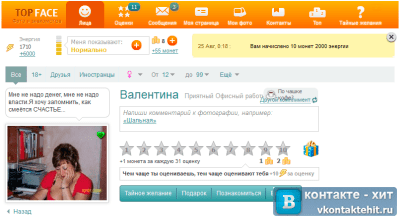
Photo rating in contact
Vkontakte dating applications are generally divided into four groups. The first includes applications in which you need to evaluate a user's photo, and if this photo is attractive, you can move on to a closer acquaintance.
The most popular of this group are, Lyceum, Photocards, Photoflirt and even the funny application The Pug. You evaluate, you are evaluated. They judge only by appearance, so if you have already decided on a similar way of dating, put up the best photo.
The main disadvantage of such applications is that mostly schoolchildren communicate there, many put an untruthful age and someone else's photo. There is also a risk of running into a lot of intimate offers. It is possible to get acquainted successfully in photo applications, but the probability is very small. But here you can find out which of your photos is especially good.
Chats with photos in contact

The second type of applications for dating in contact is chats with photos. Here they are judged not only by photos, but also by wit, sense of humor and ability to communicate. The probability of meeting your fate is much higher, but there are problems with photo applications here.
The best chat app is ““. Here they play three by three, each asks a question to the opposite sex, and according to the results of communication, the participant chooses the one he likes. If the likes match, the players open links to each other's pages in contact. Most importantly, in Asked, Saw, Loved” - choose a good question.
Video chats in contact

The next type of application is video chats, in which participants communicate via a webcam. The “pluses” of video chats are obvious: communication is almost lively, you immediately see how the interlocutor really looks. The downside is that you can run into a boor, you can be “chattered”.
The most famous video chats.
The beautiful design of the VKontakte community is not a whim, but an important element that forms users' trust in you and your company. If a public page or group is designed in an unprofessional way, your potential customers can quite logically conclude that you are also negligent in your work. To prevent this from happening, make sure that your VKontakte page is beautiful, neat and easy to use. How to do it? Read below.
Actual sizes of images "VKontakte"
Some time ago the developers social network VKontakte launched new design. This led to the fact that the sizes and principles of displaying images have changed. The memo, which will be given below, corresponds to all the innovations and contains the dimensions relevant to this moment time.
Now let's take a closer look at each item.
VK avatar size
The minimum size of an avatar is 200 by 200 pixels. If you try to upload an image that is less than 200 pixels wide or long, you'll see this error:

The maximum size of an avatar is 200 by 500 pixels. But, in principle, you can upload larger images - up to 7000 pixels on each side. The main thing is that the ratio of their sides does not exceed 2 to 5.
I'll show you with an example.
I have an image. Its size: 200 by 800 pixels (2 to 8 ratio). There are no errors when loading. However, I still can't use this image, because "Contact" does not allow me to select it completely.

Cover
The cover size for the full version of the site is 1590 by 400 pixels.

Please note: in mobile version and applications, the full version of the cover is not displayed, but only a part of it, 1196 by 400 pixels in size. See how it is cropped in the mobile app:

To prevent this from happening, position the main elements of your cover within 1196 by 400 pixels.

Attached images
In the updated design of "Contact", the width of the news feed has become fixed. This means that the images attached to the post are no longer stretched, but remain as they are. Therefore, if you want your image to fill its full space in the News Feed, it must be at least 510 pixels wide. It is best that it be a square or rectangle in landscape orientation.
It sounds a little confusing :) Therefore, I will show you with an example.
Let's say we have a square-shaped image with sides of 510 pixels. If we pin it to our post, it looks great in the news feed on all devices:

And this is what a horizontal image looks like in landscape orientation (width 510 pixels):

As you can see, the narrower the image (in height), the smaller it looks in the smartphone feed. To verify this, look at the picture below:

It is clear that the difference here is not particularly critical, and smartphone users will still consider your image, just in the second case they will be a little more comfortable.
Images for posts with links

All this data is taken from the Open Graph markup code:

If Open Graph is not specified, the title is taken from the Title meta tag, and the image is taken from the article. At the same time, you can easily change it - or select another image from the article using special arrows:

Or upload your own:

The minimum image size that you can use as an announcement for your article is 537 by 240 pixels. However, you can upload larger images as long as the aspect ratio is respected.

Picture for an article created in the editor
The image size for the cover of an article created in the editor is 510 by 286 pixels. It is better if it is dark in color and more or less monochromatic, because the name of the article and the community is lost on a light background.
Good example:

Not a very good example:

Photo and video size for stories
The size for photos is 1080 by 1920 pixels. The video size is 720 by 1280 pixels.
Specifications for video recordings:
- up to 15 seconds;
- no more than 5 MB;
- h.264 codec;
- AAC sound.
In stories, you must use photos and videos in a vertical format.
Please note: at the moment, stories on behalf of communities can only be added by large communities for which the VKontakte developers have opened this feature. And this is done using the official application. It cannot be done from a computer.
Photo album cover size
Video picture size
1280 by 720 pixels.

Wiki page
The wiki content area is 607 pixels wide. If you upload a larger image, it will automatically load 400 pixels wide. Example: I have an image that is 1366 by 768. If I add it to a wiki page, it looks like this:

To change the size of the image, you need to click on it and set the desired values:

How to work with wiki pages, I will describe in detail below. Therefore, we will not dwell on this point here.
How to make sure that VKontakte images do not shrink? Effect of background and size on picture quality.
If you have ever tried to upload images on VKontakte (whether it was an avatar picture or just a photo from your trip), then you probably already know that they tend to shrink. This is especially noticeable on a dark (and especially red) background and when the picture is not too large. Example:

How to make sure that the quality of the pictures does not deteriorate?
In order for the image not to shrink (more precisely, it shrinks, but to a much lesser extent), it is necessary to make it 2–3 times larger than the desired size. For example, if we need to make an avatar sized 200 by 500 pixels, we take a picture with a size of 400 by 1000 pixels. If you need to make a menu 510 by 400 pixels in size, we take - 1020 by 800.
The dark blue image I posted above is 510 x 350. I made it twice the size (1020 x 700) and saved it. That's what came out of it:

How to fix it? The answer is very simple - you need to choose a different background. The point is that on dark background pixels are visible better than on light. Therefore, if you want to achieve perfect quality(although the picture above already looks quite normal), then you need to slightly change the color scheme. For example, make the background white and the text blue:

How to design a page header
Your hat public page or groups - this is the first thing users see when they visit you. In most cases, a navigation menu based on public materials, some interesting posts or important announcements are placed in this place. Let's look at examples of how different companies use this space.
Cover
Not so long ago, VKontakte introduced an update - now you can upload large and beautiful covers (1590 by 400 pixels) to the pages. To do this, go to settings and click the "Download" button.

You can place anything on the cover: from the name and motto of your company to all kinds of promotions, offers and even contests.
I recommend paying special attention to the possibilities of dynamic cover. Read our article about how it works, for what purposes it can be used and with what services to install it.
Examples of dynamic covers:
Cover + description of the community + link to the site
Some companies specifically do not fix any posts in the header so that users have the opportunity to read the basic information about the page and immediately go to the site.
Description with hashtags
Some companies add hashtags to the standard description of the page that characterize it. This is done so that the page has a clearer relevance, and due to this, it is higher in the search for relevant queries. To be honest, I don't know if this method works or not. I have not seen cases on this topic, so if anyone knows, I will be grateful if you share the link.
Pinned post telling what the page is about
If you want to tell about your page in more detail (with photos, links and beautiful layout), then you can attach a wiki post or an article made in the editor to the header with a bright picture on the announcement that will encourage users to click on it. An example of such a post:
And here is what the user sees after he clicks on the link:

Group menu open
I call an open menu such a menu, which immediately shows what items it consists of. That is, the picture-announcement of the wiki post completely duplicates its content. Thus, users immediately see what awaits them inside. I'll show you with an example.
Here's what a pinned post looks like in the header of a Flatro page:

Group menu closed
The closed menu is the same wiki post as in previous paragraph, only on the announcement there is a picture on which there are no menu items. Usually they write on it: “Menu”, “Navigation menu” or “Navigation through public materials”.
Here's what we see when we click on it:

By the way, it is worth noting that these are far from the only options. In fact, you can write whatever you want on this picture. The main thing is that the user wants to click on it, and he understands what awaits him after that. Example:
Group menu
A merged menu is when the picture on the announcement of your menu is one image with the avatar. A little lower I will tell you in detail how to make such a menu, but for now just look at how beautiful it looks.
GIF and avatar in one image
But this hat design really impressed me a lot. An auto-playing gif merges with the avatar into a single composition and attracts the attention of users, even though there is no information at all on it.
By the way, I spied this example in the group of SMM marketer Sergey Shmakov. So, I thank him for the find :)
Hidden menu
The hidden menu is available only for groups (pages do not have such functionality). To see it, you need to click on the corresponding link. The advantage of this design method is that users can see the basic information of the community, and if they want to use the menu, they just need to make one click. However, there is a small downside here - not all users know about the existence of this feature, so your menu may receive less attention than if it was pinned to the top of the page.
Autoplay video
At the end of November 2015, an interesting innovation appeared on the VKontakte social network - as soon as a user enters your page, the video attached to the header starts playing automatically. With this technique, you can attract even more attention of users (especially those who first visited your page), and at the same time, not annoy those who do not like it when their content is imposed on them, because the video plays without sound and practically does not interfere .
How to add this video to the header of your page?
To do this, three conditions must be met:
- Attach a video to a post and pin this post to the top of the community.
- In addition to the video, nothing else should be attached to the entry. Only video and text optional.
- The video must be uploaded by VKontakte - third-party players are not supported.
A post that gets a lot of reposts
Another way to productively use the space in the header of your page is to pin one of your most successful posts to it - the one that has already gained and continues to gain. a large number of likes and shares. Why do this, I think everyone understands - the more reposts, the greater the coverage, the more subscriptions the page receives.
Announcements of new clips, albums, events
Presentation of new products/services
Discounts and promotions
Cases, customer reviews
Application advertising
Practical jokes
Community Rules
Links to other social networks
I have listed far from all the design options for the cap. In fact, on the cover and in the pinned post, you can post any information: jobs, announcements, links to the best selling products, etc. So do not limit yourself to the examples above. Turn on your imagination and use the design of your community to achieve your goals.
Performance marketing from TexTerra - we promote a business with payment for leads. We guarantee results even in a difficult niche.
What should be the avatar
An avatar is not only a beautiful image with your company logo, but a working tool for a marketer, with the help of which he achieves his goals. Let's take a closer look at how it should be in order to attract the attention of users and encourage them to complete the target action. Let's start with the thumbnail.
Avatar thumbnail
- The text on the avatar thumbnail must be large enough to be readable.
- The text must not extend beyond the thumbnail.
- Users should be clear what is shown on the profile picture.
- If possible, it is best not to use stock images, as they often lower the credibility of the company.
- It is undesirable for the avatar thumbnail to be too faded and boring, otherwise it will be lost against the brighter competitors' avatars.
- If you want your avatar to look modern, make it in a minimalist style: less text, shadows, gradients, and elements that do not carry any semantic meaning. Your avatar should be as simple and neat as possible. This style is trending right now.
- If your goal is to attract the attention of users and stand out from other avatars in the feed, you will have to turn on your imagination. Think about what you yourself pay attention to when looking for interesting communities? Here, for example, I have been attracted several times by avatars with a burning light, which usually indicates that a new message has arrived. This is a very old technique, but for some reason it still affects me - when I see such a light, I will definitely keep my eyes on it.


I'm not saying this trick will work on your page as well. The message I want to get across is that there are so many ways to stand out, you just have to ask yourself the question and get a little creative. Here, for example, is another interesting idea that I would hardly have thought of myself:

The avatar is a black circle: large and small. It would seem, why do it at all? But when you scroll through the list of communities, such avatars attract attention, because they are very different from everyone else.
What information can be placed on the avatar thumbnail
Although the avatar thumbnail is very small, it can (and should) be used to attract followers to your community. How to do it? Let's look at a few options:
Announcement of a new product/service/event

Benefits of the company/service/page

Company phone number

Favorable prices

Free shipping

By the way, very often the information that the company provides free shipping is added to the name of the group itself, so that users will definitely pay attention to it.

Stock

Contests

Jobs

What should be the avatar itself?
I considered what the thumbnail of the avatar should be and what text can be placed on it. Now let's move on to the avatar itself. Full version the avatar will only be displayed in a community that does not have a cover image set. It is for such cases that I wrote this section. So, what should your community avatar look like so that users immediately understand that your company approached the creation of the page responsibly and professionally.
- The avatar must be of high quality. About how to achieve this, I wrote a little higher. For those who missed this part, in short - the size of the avatar should be 2-3 times larger than what you planned.
- It is desirable that the avatar be combined with the menu: be of the same color scheme, have the same fonts, elements, etc. Thanks to this, your page header will look more neat and professional. Example:
- The avatar itself and the avatar thumbnail may be different. For example, you can draw a circle on the avatar, style it however you like, select that area as the thumbnail, and style the rest of the avatar in a different style.
- In order to encourage users to subscribe to your page or write a message to a company representative, you can place an appropriate call to action at the very bottom of the profile picture and accompany it with an arrow pointing to the button.
- Try not to put too much information on the avatar, otherwise it will look overloaded and untidy. Add only the most important points to it and make sure that there is “air” between them.

Another option is to divide the avatar into two parts. One for the thumbnail and one for the rest of the avatar.


What information can be placed on the avatar?
In fact, anything can be placed on the avatar. Unlike a miniature, there really is where to roam. Most importantly, do not abuse it :)
Site domain

Phone / address / opening hours

Contests/promotions

Most Purchased Products/News

information about delivery

Mobile App Advertising

The main advantages of the company / page / product, etc.

Range renewal/new creations, etc.

Information that your community is official

Information about upcoming events

Addresses of accounts in other social networks

Extended page description

Boasts

In general, absolutely any information can be placed on the avatar. I have included just a few ideas so you can see what others are doing and be inspired by their examples. Well, keep in mind the main recommendations: the avatar should be of high quality, the font should be large, and there should be more “air” between the elements.
How to create a merged avatar and menu
In order to make a merged avatar and menu, you need a program Adobe Photoshop or its equivalent. I will explain the whole process using Photoshop as an example. So let's go.
- Download the template for Photoshop, which I specially prepared for this article. Normal size (menu 510px wide, avatar 200) or zoomed (menu 1020px wide, avatar 400).
- Open the image you want to take as a base.
- Copy it, paste it into the template and position it the way you would like it to be cut.

- Add effects, text, graphics, and more.

- If you don't want part of the image to be lost (in that gap, which is 50 pixels), move it to the right as shown in the following GIF:

- Select the "Nesting" tool and click on the "Fragments along the guides" button.

- Delete unnecessary fragments (right-click - "Delete fragment") and edit the existing ones (right-click - click in an empty place - take the desired area and stretch it to the desired size).

- Go to the "File" section and select the "Save for Web" command.

- Go to the place where you saved the pictures (desktop or some specific directory) and find a folder called "Images" there. This is where your images will be. Now it remains only to fill them on the page.

P.S. The height of the avatar can be changed at your discretion. I took maximum size- 500 pixels, but you can have this value less. For example, as in the "Wiki markup" page:
How to use widgets
Widgets are also part of the design of the VK community. With the help of them, the user can: place an order, subscribe to your newsletter, take part in a contest, read and leave reviews, open a community search, receive a gift, a discount coupon, etc.
Here are some examples of what widgets look like on the VKontakte page:


How to post images
If you are a web designer or have an artistic taste and sense of beauty, then it will not be difficult for you to come up with a corporate identity for your images. However, it seems to me that there will be a minority of such people in this article (by the way, I am not one of them either). Therefore, let's take a closer look at how this is done, based on examples of successful companies.
By the way, please note that almost all well-known VKontakte companies brand their images, that is, they add a small logo, their page address or a watermark. This increases brand awareness and protects your images from being copied. Is it worth it, everyone decides for himself. The only thing I would like to advise is that if you do decide to do this, try to make sure that your logo is not too bright and does not take up too much space, otherwise all the emphasis will go to it and the image will lose its appeal.
Where can I get good images?
We have a good article on this topic on our blog - "". They are all free, but some require registration. If you do not find anything suitable for yourself, try searching by keyword+ wallpaper (or, if in English, wallpaper). Typically, such a request produces high-quality images. But here you need to be careful and check the type of license, otherwise, if you have a serious business, you can run into trouble.
And what about those who do not know how to work in Photoshop?
If you have never worked in Photoshop (or any other graphic editors) and are not yet ready to take the time to master it, you can use the services that already have ready-made templates pictures for different social networks:
1. Fotor.com


After that, on the left side of the screen, select the template that interests us. Please note that only those templates that do not have a diamond icon are provided for free.


Insert it into the template, select it with the left mouse button, select the Layer command (sandwich icon) and click on Move to bottom. Thus, our picture will go in the background, and all the inscriptions will be superimposed on top of it.

After that, we change the text, font, font size, position of the inscription, etc.

Then click on the icon in the form of a floppy disk, select the name, image format, quality and click on the Sign in to download button.

2.Canva.com
Another service that will help you beautifully arrange your image. It works on the same principle as the previous one. Register in the service (you can use your Google account+ or email).

Choose your field of activity. We skip the step where you are asked to invite friends. We get to the main menu, where we select a Facebook post if we need a rectangular photo, or an Instagram post if we need a square one.

Select a template (if the template is marked "FREE", then it is free), change the text.

If necessary, upload your image, adjust the size, change the text, font and position of the inscription. After that, click the "Download" button, select the image format and save it to your computer or any other device.

How to format articles in the editor
Since recently, VKontakte has been able to typeset articles in a special editor. To create an article, you must click on the letter "T":

How to use wiki markup
Well, here we come to the most interesting and at the same time difficult section. Perhaps there are people among readers who do not know what wiki markup is, and in general they hear this term for the first time. Therefore, especially for you, I will give a definition that "Contact" itself gives.
Wiki markup is a markup language that is used to format text on websites (usually classified as wiki projects) and makes it easier to access features HTML language. On our wiki page - good alternative regular posts and text navigation. If you need to create a large article with different text formatting (bold, underline, headings, etc.) or add graphics to it, or just create a colorful navigation menu for your community, a wiki is indispensable.
Just like Wordpress (or any other CMS) has an HTML editor with which you create articles, Contact has its own editor for creating and editing wiki pages. It looks like this:

With this editor, navigation menus are created, as well as articles with pictures, videos, and audio recordings. A little lower I will analyze in detail how to work in this editor, but first I ask you to bookmark two links for yourself. They will help you a lot in learning wiki markup.